Data is everywhere, but turning raw data into valuable insights can be a challenge. At Digital Power, we help you with a dashboard that brings together scattered data, visualises it clearly, and provides immediately applicable insights. This enables you to make faster and better-informed decisions.
How can dashboarding help you?
A dashboard provides a central place for all your data, allowing you to work more efficiently and make better decisions. This helps you to:
Easily monitor KPIs and improve performance.
Reduce wasted time on manual reporting.
Identify trends and patterns more quickly.
Gain reliable, up-to-date insights.
Foster a data-driven mindset in your organisation.
The phases of a dashboard implementation
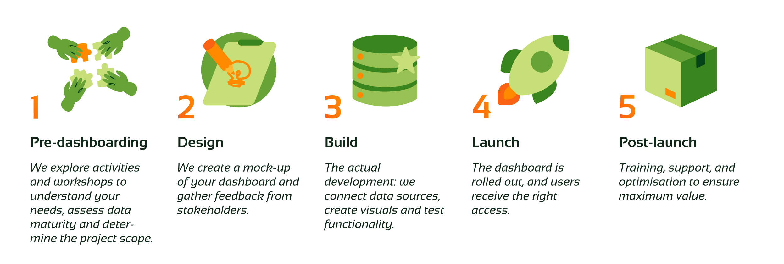
Below, you can see the different parts of our dashboarding solution. We start with pre‑dashboarding and design, build and launch the dashboard, and stay involved after go‑live with training, support and optimisation.
We collaborate to create a tailored plan for the project, estimating the hours required for each phase. Initially, we invest together in the pre-dashboarding phase, where we refine our understanding of the project’s scope. This allows us to better estimate the hours needed for the subsequent dashboarding and post-dashboarding phases. At the end of the pre-dashboarding phase, we provide a detailed proposal for the remaining phases. This plan is fully tailored to your specific needs and contains the components that will provide you the most value.
Throughout the process, we keep stakeholders informed and involved, and our standardised ways of working will help keep the cost low for you, while being agile enough to adjust to your needs.
There is no single answer to this because every dashboard we create is custom-made. What your dashboard will look like depends on several factors: what your goals are, which KPIs you want to track and who will work with it.
Do you need a dashboard for daily control or at management level? That also determines the design. Whatever your situation: we always make sure that the dashboard fits within your organisation's house style and that it matches what works in your sector.
During the discovery phase, we map out together which functionalities you need and what the expected costs will be. That way, you know exactly where you stand.
Clear, timely insights.
More efficient processes and fewer errors.
Better strategic decisions.
Time savings through automated analysis.
We involve end-users throughout the process and provide training to ensure the dashboard is relevant and practical.
By spending less time on manual reporting and gaining quicker insights into opportunities, a dashboard quickly pays for itself.
No, we provide documentation and training so that you can maintain the dashboard independently.
From dashboard to data-driven working: marketing team takes control of its own data
Retailer EyeCare Groep made the transition from an external to an internal marketing dashboard. This immediately served as the starting point for working more actively with data. Using a central dashboard as a basis, we guided the marketing team towards a new, data-driven way of working. As a result, data has become part of the conversation within the team, marketers can explore insights independently, and they can make decisions more quickly.
Work more efficiently through a Salesforce dashboard
Serve the City makes volunteering accessible by connecting volunteers with organisations and projects: from walking with the elderly to doing repairs in community centres.
With Serve the City Young, the organisation focuses on young people, students, and schools. Larger projects are organised through schools, allowing young people to easily get involved in volunteering.
Power BI dashboard improves machine efficiency and reduces production costs
Essity is an international hygiene and health company active in more than 150 countries. It produces products such as tissues, incontinence solutions, medical items and nappies, under well-known brands including TENA, Libero and Lotus. The company has a strong focus on innovation and sustainability, aiming to improve people’s daily lives through its products.
Voedselbank Utrecht aims to provide families and individuals living in poverty with healthy and varied food packages. Data insights are essential for this mission: how many people are being helped, where the greatest needs lie, and how demand evolves over time.
Transforming data into business value with insightful dashboards
With the right dashboards, you quickly extract valuable insights from your data. This allows you to make better choices and add immediate value to your organisation. In an interview with Consultancy.eu, Antonie van Velzen and Iga Jarosz explain how our dashboard solution helps you get a grip on your raw data.
An innovative start-up in the baby care sector aimed to work in a data-driven way in order to gain valuable insights and enable strategic growth. They engaged our support to help realise this ambition.
Maximise your impact with a user-friendly dashboard
Impact Matters connects business professionals to social issues of charities and foundations. In doing so, they ensure that the right need and expertise are brought together.
How do you create a dashboard that continues to add value?
It sounds simple: you regularly receive questions about a certain topic, so you decide to launch a dashboard to provide easy access to the answers. Usually, a great deal of time goes into creating these dashboards. You’ll find plenty of step-by-step guides online on how to build a good dashboard, but in the end, it’s often used far less than expected. Why does this happen—and more importantly: how can you ensure that you only build dashboards that are genuinely used?
This is how you determine the KPIs that will make the difference
Key Performance Indicators or KPIs are indispensable to keep track of the performance in an organisation in a practical way. It is therefore important to choose the right KPIs and to keep a clear distinction between KPIs and PIs. In any case, KPIs must match the mission and vision of your company. In this article, Rogier explains how to determine your KPIs and shows you the most common mistakes.
Optimisation of marketing activities through an integrated dashboard
Valk Digital, an internet company, aimed to adopt a more data-driven approach. The marketing team was already discussing all the data weekly using an Excel spreadsheet, but due to manual data input, it was time-consuming and more likely to fail. There was a need for an automated, future-proof approach based on reliable data.
Dienst Testen is a crisis organisation created during the corona pandemic. Under the banner of the Ministry of Health, Welfare and Sport (VWS), Dienst Testen ensures that everyone in the Netherlands can be tested quickly and reliably. Dienst Testen does this in collaboration with the municipal health services (GGDs) and laboratories. To quickly gain insight into the corona test figures in the Netherlands, Dienst Testen asked us and a number of other data consultancy parties to create dashboards in collaboration.
Clear dashboards for the IC team during the Corona crisis
In times of the coronavirus (COVID-19), a good overview of the patients in the scaled-up intensive care of the Utrecht medical centre is vital. Employees must be able to view patient characteristics, the most current lab readings and the course of patients' vital signs at a glance. In addition, up-to-date insight into the bed occupancy per department and the capacity of the nursing staff is required.
We immediately got started to provide the necessary insights for UMC Utrecht. As a way of also contributing in these times of crisis, we offered our hours free of charge.
More reach, engagement and online conversion thanks to insights from online content dashboards
Elsevierweekblad.nl is an online platform with news, opinion and background information. Various authors write articles on a variety of relevant topics on a daily basis. Elsevier Weekblad wanted to get a better grip on the content formula behind this. This required insight into the extent to which the types of content contribute to reach, engagement and sales of subscriptions.
Increased ROI in healthcare campaign thanks to improved insight
Various departments within Univé made decisions based on data from multiple data sources and separate reports. As a result, each department made decisions based on different information. The departments were also not always aware of each other's performance. We investigated how the integration of the data sources using the Microsoft Power BI visualisation tool could improve decision-making.