How can you tell if your GTM tagging server works?
Automate your tagging server monitoring with Google BigQuery and Looker Studio

There are reasons abound for deploying a tagging server on your website. This blog will not be about why it makes sense (or why perhaps in your case it doesn’t) to use server-side tagging. Instead we will jump forward in time and ask ourselves another pertinent question: ‘how can you tell if your tagging server is doing what it is supposed to?’
A quick disclaimer about this blog: this post is written for Technical Web Analysts, by a Technical Web Analyst, which means that we will stay in the realm of the Google stack for this project. Another disclaimer (the final one, I promise): this post is not about setting up real-time server downtime alerting. For this purpose it is better to make use of the features offered by your cloud service provider of choice.
After shedding lots of sweat and hopefully few tears, your tagging server is up and running like a high-speed bullet train and no event is safe from being scooped up by the server. At least, that is the hypothesis. But how can you measure your server’s performance compared to the classic client-side tracking?
During a recent project, I was tasked with setting up a tagging server for a large energy provider in The Netherlands. The idea was that, at least for the first few months, the tagging server would run in conjunction with client-side tracking. In terms of cloud computing, the Google Tag Manager Server was deployed in an Azure Kubernetes Service container. In terms of computation resources, AKS are the most powerful in terms of scale-up capabilities, so it would seem that handling all events from a high-traffic volume website should be no problem at all. Since data is our bread and butter, we don’t just believe everything will work out fine, we want to measure and analyse exactly how our server-processed data compares to the client-side data.
For this purpose, I built a Looker Studio dashboard that compares, minute by minute, server-side collected events with client-side events. Drilling down to the minute scope allowed me to spot specific issues in the data collection process and observe the impact of my changes made in GTM. Next, by matching server and client-side event counts with one another I was able to spot issues on the event level in the blink of an eye.
For this to work we need to be measuring both our server and client-side data simultaneously. It makes sense to do so for a period after deployment of the tagging server, since it takes time for your server-side dataset to collect sufficient user and session-based data. Basically we want to start off with a server-side tagging implementation that resembles the existing client-side data as closely as possible. At the risk of stating the obvious: we will be sending our server-collected events to a GA4 property separate from the existing client-side property.
Lastly, we need to make sure that both our client and server-side GA4 properties are linked to Google BigQuery, because it is in BigQuery that we want to build the source table for our project. As we will not be using BigQuery for real-time alerting and monitoring of the tagging server, checking the batching export option will suffice.
Building our BigQuery source tables
Before we get our hands dirty on the dashboarding itself, we need to transform our raw event data tables and store the output in separate tables. By drastically reducing the number of columns in our data source table, we ensure that Looker Studio will work quickly and that we stay in control of costs.
If your organisation already has a large number of data sets in BigQuery, it might be challenging to find the newly created dataset from your server-side GA4 property. I found that the best way to look for the correct table is by looking at the ata set info, and see if the Created row matches the date you created the product link in in GA4.
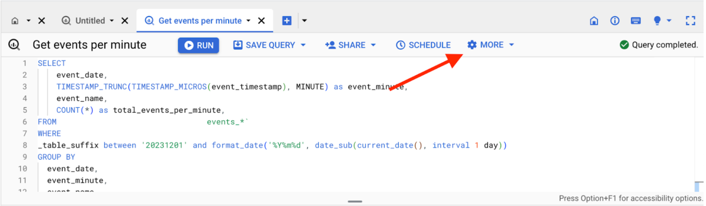
Now that we have our data set, it is time to build a query! We basically want to know how many times per minute a certain event was recorded. For this purpose I wrote the query below:
SELECT
   event_date,
   TIMESTAMP_TRUNC(TIMESTAMP_MICROS(event_timestamp), MINUTE) as event_minute,
   event_name,
   COUNT(*) as total_events_per_minute,
FROM `[Redacted].analytics_[Redacted].events_*`
WHERE
_table_suffix between '20231201' and format_date('%Y%m%d', date_sub(current_date(), interval 1 day))
GROUP BY
 event_date,
 event_minute,
 event_name
ORDER BY
 event_minute desc
Note that we want to compare client-side to server-side events from the first day of complete event collection in the server-side GA4 property, which in the case of this project was the first of December of 2023. Also pay close attention to the last date returned in the query. I found that sometimes, yesterday’s table was already closed for the server-side dataset while at the same time, yesterday’s data was not yet available in the client-side property.
To verify the date of the most recent available dataset, go to the events table in your dataset and look for the date that is displayed there.
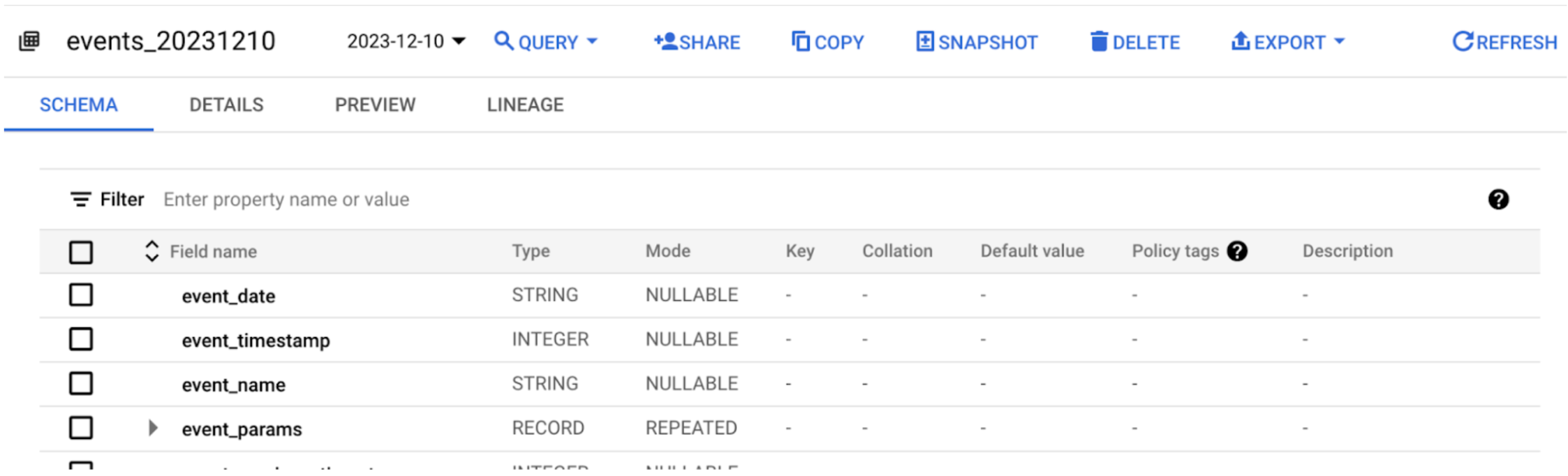
In the example above, the most recent available data is from December 10, 2023.
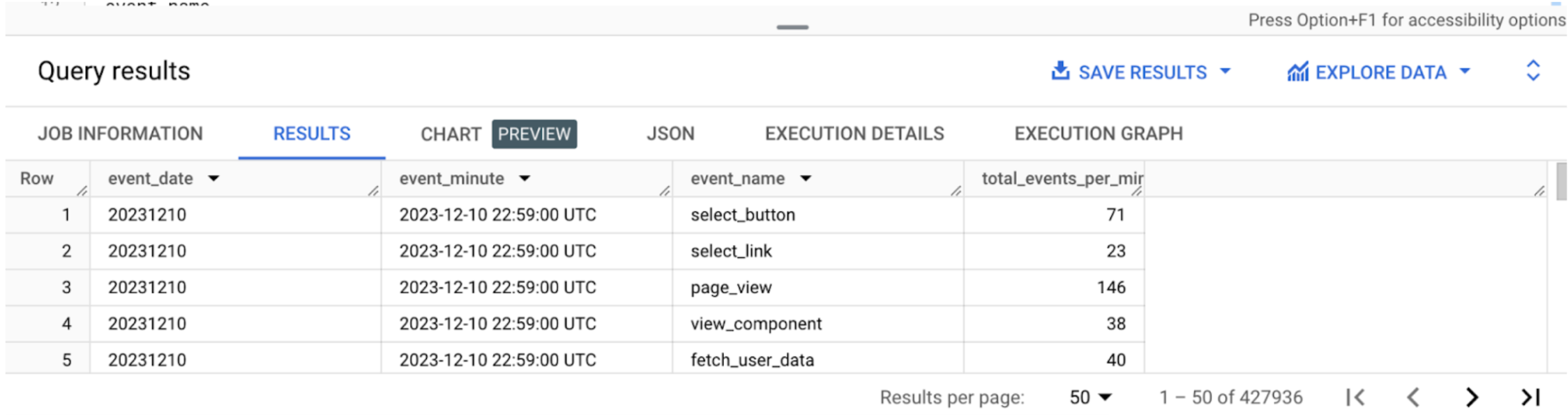
Now the moment has come to run our query. You will see that for every minute of the day, and every event that occurred in that minute, a separate row is returned.
Let’s wrap up the work in BigQuery and start storing our query results so that we can use it as a data source in Looker Studio. For this purpose, choose ‘save results’ and select ‘BigQuery table’. Keep in my mind that the name you submit here will be the name of your data source in Looker Studio.
With that out of the way, let’s also store our query by clicking ‘save query’. This will be important for when we want to update our data source table.
Speaking of updates: depending on how frequently you want the dashboard to be refreshed, you can choose to automate the process and schedule the query, or you can opt to manually update the query when needed. In the case of the latter, in the terminal, click ‘more’ and select ‘query settings’.
In the panel that has opened, choose ‘set a destination table for query results’ and submit the name of the table you created earlier in the field ‘table ID’. If you’re following the query exactly as it was provided in this post, you will have to choose ‘overwrite table’ as the destination table write preference. Looker Studio should show the updated dataset in a matter of seconds after hitting the dashboard’s refresh button.
Now that we have our server-side data safely stored in a BigQuery table, it is time to repeat the process for our client-side data. Once that’s done we no longer need to work in BigQuery and can move on to Looker Studio.
Creating the dashboard
Setting up the Looker Studio environment
Now that we come equipped with our data source tables, it is time to visualise our data and start answering our primary research question. The aim for the visuals is to provide us with an insight on how the server-side tagging is collecting data compared to the client-side tracking method in a single glance. This means that a visual needs to contain data from our two data sources.
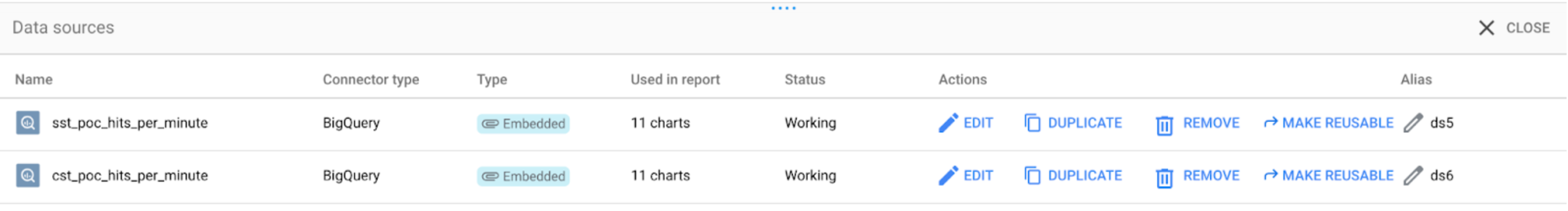
Let’s start off by connecting the dashboard to our two data sources. In Looker studio’s menu, go to resource > manage added resources. Select ‘add a data source’ and choose ‘BigQuery’ as your source. Look for the data sets containing your server and client-side data tables and add them to the dashboard.
Create the data source for the dashboard visuals
With that out of the way, let’s look at what we want to accomplish: a chronological overview, minute by minute of the event hit count for both our server and client-side datasets. For this purpose we will use a line graph.
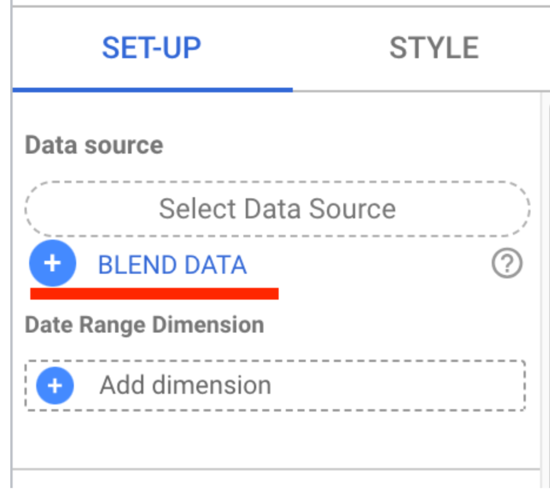
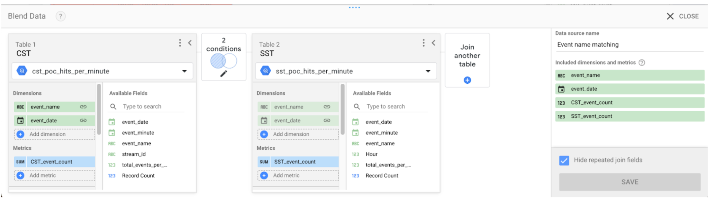
Getting two different data sources displayed in one visual means that we’ll have to blend data. In the set-up menu, choose blend data. An overlay will open where you will define the data model of your blend.
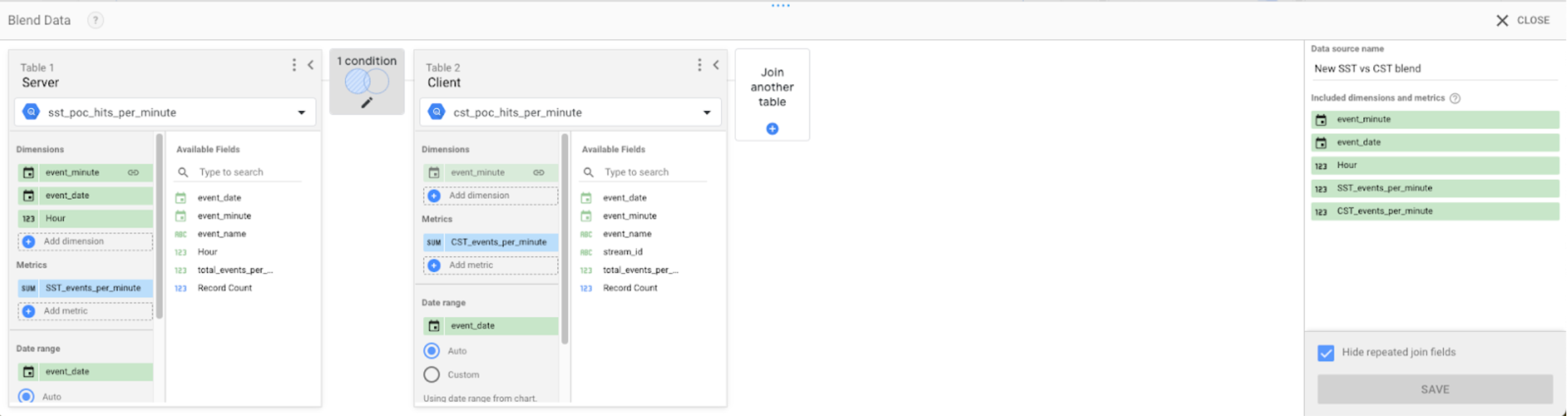
Start off by giving your blended data a descriptive name. Then make sure you won’t mix up which table is from the server and client dataset by naming the tables (trust me). Next, we’ll make sure that rows from the server dataset can be linked to those from the client dataset. Since we want to be reporting by the minute, we’ll use our ‘event_minute’ dimension to create the link.
Also, it is worthwhile to import the event_date key into the blended dataset’s dimensions as well as date range field, since it’ll allow us to use Looker Studio’s built in date range control. Lastly, we of course want to see the number of events per data source. In BigQuery we gave the event count column in both datasets the same name.
For our data visualisation, we’ll have to rename them to keep them apart. You can do this by clicking on the edit button on the left from the metric title card. You should end up with something looking like the screenshot below.
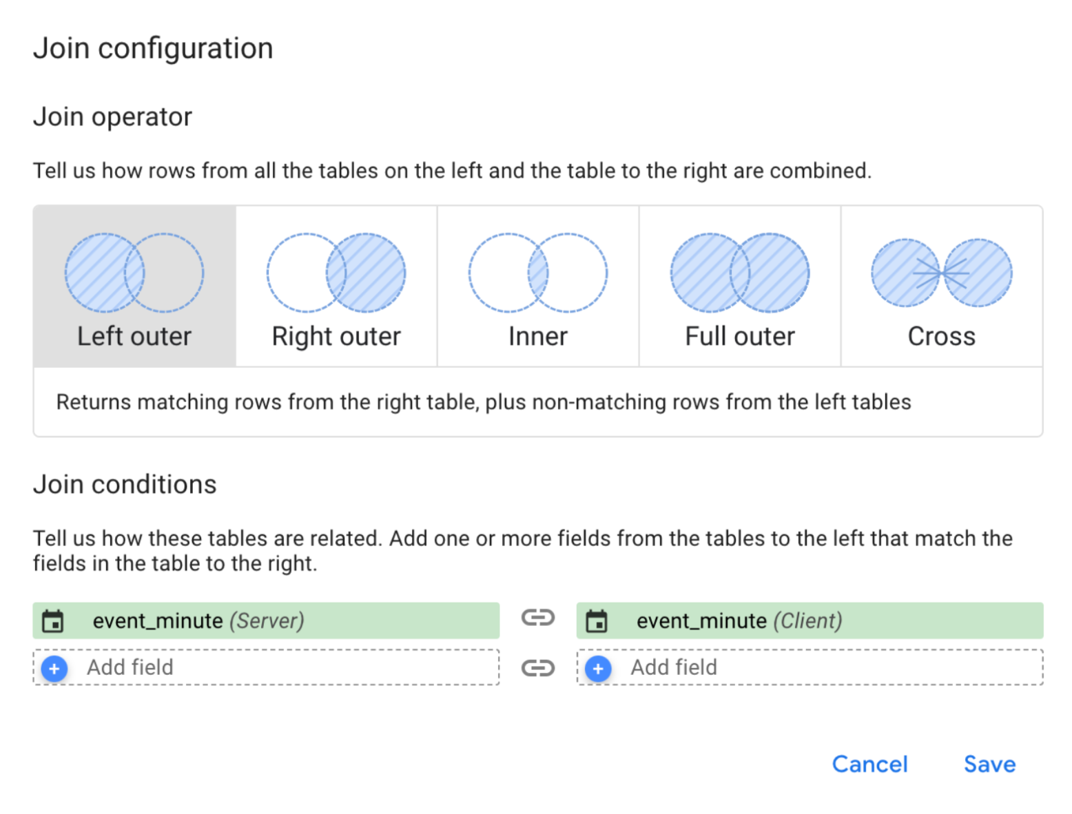
To wrap things up we need to choose the join type for these two datasets. In this case we’ll go with ‘Left outer’ for the event_minute dimension. Hit the save button and you’re ready to rumble! It’s about time to get that line chart up and running.
Add visuals to your dashboard
Click ‘Add a chart’ and make sure it’s connected to your data blend.
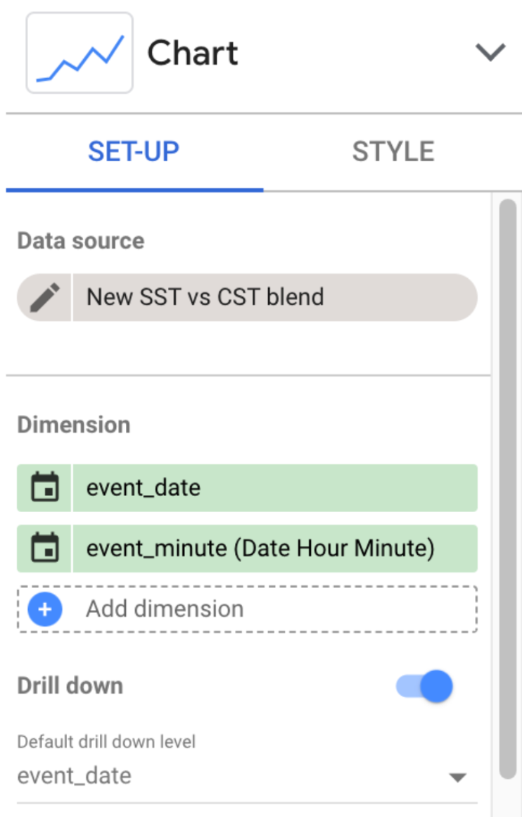
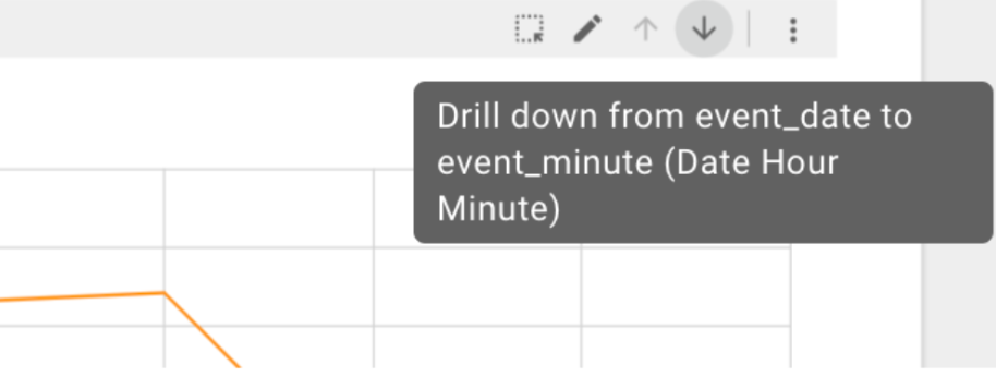
For the dimensions, I have opted to first display the event_date, with event_minute coming in at a close second. The reason for this is that it may be easier to spot data collection issues (more about those later) for a specific day on this level. When getting down to the nitty gritty minute by minute report, you can use the drill down function handily provided on the chart.
As far as the metrics are concerned, it speaks for itself to add both event counts here. If all went well, you should now be greeted by a magnificent looking graph. In terms of adding functionality and styling you can add as much icing on the cake as you like, I for one opted to keep things simple. I did find it useful to enable the Zoom functionality all the way in the bottom of the chart set-up menu under ‘chart interactions’. This feature is particularly useful when viewing the minute-by-minute view.
The final output should look something like this:
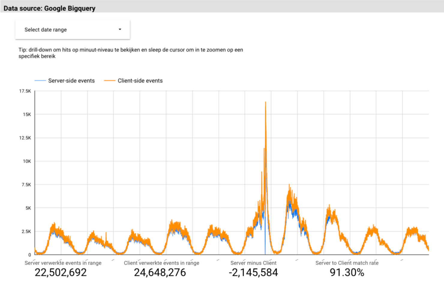
You may have noticed I added some scorecards below the graph. This is of course entirely optional. For the last two scorecards, I used calculated metrics to display a ‘match rate’ which is basically dividing the server-side events by client-side events and setting the metric display to percentage.
With the work done so far, we can identify issues with the data collection pretty easily.
Bonus visual: table for event comparisons
My next move was to also pull out an overview of all the events collected for GA4 and compare the event count between the server and client-side dataset. Here there is no need to look on a minute-by-minute basis so I created a new data blend for this purpose.
In this blend we’ll link the event_name and the event_date using left outer with one another. The output should look something like this:
After finishing the blend we will create a simple chart containing event_name, event count for both sources and, if you feel like it, the same calculated metrics used in the line graph. To greatly enhance the functionality of this chart i’ve slapped some conditional formatting on it which allows me to quickly spot which server-side events are collecting fewer event hits than their client-side equivalents.
Next to the chart, I added a bar chart that once more shows the ‘match rate’ I used previously. This time though the match rate is more actionable because any filters you apply to the chart are also applied to the bar chart. This way you can spot any issues with specific events for any given day.
That’s it, we now have completed our ‘server-side tracking war room’. From this report we can easily pinpoint issues with the data collection process and act accordingly.
Actionable insights from this dashboard
In this section I want to take you through some of the issues I identified using this dashboard and how I solved them.
Firstly, by looking at the first few days recorded on the line graph it is instantly obvious that the tagging server is under reporting events by some 10%. This is where the chart comes into play. Without any filtering, it instantly becomes clear that the server is missing a great many page_view events. Given how frequent this event occurs, this is a red hot smoking gun as to why the tagging server is recording fewer events. After a stroll in GTM, I discovered that one of the GA4 page_view event tags in the WEB container was wrongly configured leading to the GA4 server client not accepting this request. Once this issue got sorted, the ‘SST match rate’ shot up higher than this year’s inflation percentage.
Secondly, the giant elephant in the room is the massive surge in client-side recorded events and the corresponding crash in server-side events. Here it appears, we caught our first server downtime. After meeting with our data engineering team it appeared that the implementation owner was featured on primetime national news, leading to an extreme flow of traffic to the website. Several services in Azure, including the tagging server, were unable to scale up in a timely fashion thus leading to them crashing.
Thirdly and lastly, the table chart allowed me to spot several events that were created by a colleague after me setting up the tagging server, thus prompting a discussion about the need to add the duplication of any client-side tracking tag, into a server tag equivalent in the definition of done.
Conclusion
In wrapping this up, getting your tagging server to play nice is more than just a set-it-and-forget-it deal. It's about diving into the nitty-gritty, comparing the server-side coolness with the old-school client-side tracking, and really seeing what's up. Through our journey with Looker Studio and BigQuery, we've seen how to spot the sneaky glitches and tune things up to keep our data on point. Remember, in the ever-changing digital world, it's all about keeping your data game strong and your analytics sharper than ever. So, roll up your sleeves, dive into those dashboards, and make sure your tagging server isn’t just running, but running like a champ.
We’re ready to help
Feel like building a monitoring dashboard of your own but don't have a working tagging server yet? Feel free to reach out to us, we'd love to help you on your way!
Receive data insights, use cases and behind-the-scenes peeks once a month?
Sign up for our email list and stay 'up to data':