Analysis of ratings and reviews of the Philips Hue app

Signify

  • Customer case
  • Data Analytics
  • Data consultancy
app ratings analyse
signify-logo
Reimer-business-manager
Reimer van de Pol
Business Manager
3 min
21 Feb 2020

The Internet of Things (IoT) system from Philips Hue, part of lighting manufacturer Signify, includes a mobile app. This allows end users to control their smart-home lamps both locally and remotely. They rate their experiences with the mobile app and the rest of the IoT system via Google Play or the App Store. Due to the large number of ratings and reviews, it is time-consuming to analyse them manually and recognise recurring themes.

Signify asked us to contribute to a solution that makes it easier for them to analyse the ratings and reviews. Based on the insights obtained, the lighting manufacturer can set the right priorities for fixing bugs, improving existing features, and developing missing features.

Our approach

Hundreds of ratings and reviews are received per release of a new app version. The main data points that are collected are the rating (1–5 stars), the date of placement, the app version, the platform, and the text.

To gain insights from these data points, it was important to be able to classify the texts. We did this with a Python script that first translates the review text into English and then determines the categories based on keyword matching.

An example of a 4-star rating + review (Google Play Store)

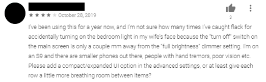
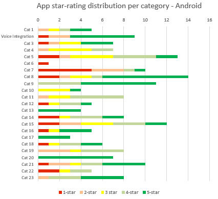
Using the script, we enriched the available data points with one or more category labels. For example, we can visualize per period and/or per app version how certain categories are assessed.

The result

There is now better insight into the opinions and experiences of the end users with regard to specific parts of the app. We can also use the script to monitor the influence of improvements and bug fixes on the ratings that users give.

This new way of working helps Signify adjust the roadmap based on feedback from its own users. In this way, they can improve the user experience of the IoT system. By focusing on categories with a lot of reviews and a low rating, the most impact can be made. For example, geofencing has been improved on the basis of this process.

The script can be further improved in the future by applying machine learning. For example, it has become possible to automatically detect new categories.

Example of rating distribution by category for an app version (fictitious data). Category 7 would be prioritised in this example: there are a lot of responses with a 1-star rating.

Want to know more?

Reimer would be happy to talk to you about what we can do for you and your organisation as a data partner.

Receive data insights, use cases and behind-the-scenes peeks once a month?


Sign up for our email list and stay 'up to data':

You might also find this interesting

The 'app rating' as a metric for your product team

Before downloading a new app, consumers often look at the app's rating. This is shown in stars with 5 stars being the highest rating. What does the app rating mean for your organisation? And for your users? The app rating is a metric that accurately reflects the tension field between marketing and product. While the importance of a high rating is obvious, a shortcut can be taken on the way to it. How does your organisation use the app rating?

Read more
People laughing at the office

Data Analyst

Dive into organisations' offline and online data and visualise the insights from your data analysis in dashboards and reports. Advise on concrete action points that follow.

Read more

App optimisation for a better user experience

'How do we make our app more accessible to people from Vietnam?' During a Learning @ Location Day, our multi-disciplinary team of data professionals worked on this Oxfam Novib challenge.

Read more
klm vliegtuig

Product analytics for essential insights into usage and usability

KLM employees work with various applications on a daily basis. For example, the ground staff uses Appy2Help. This digitises work processes and supports employees in answering all questions from passengers. iMech helps to free up more time for maintenance instead of administration and the intranet is my. klm is the starting point for everyone within KLM to find information. KLM asked us to support various teams in developing good applications using insights from user data.

Read more

Is your product really being used?

You have worked with your product team on developing a new product. You have certain expectations of how users will use the product. The only question is: is this really the case? Are they using the product as you imagined? Who is using the product and who is not? In this article we discuss the Product User Activity Model. This model gives you more insight into the current and potential use of your product to take targeted action for growth.

Read more
Data Analysts from Digital Power

Your Data Analytics partner

Collect reliable data and transform it into real-time dashboards, clear insights, and objective advice.

Read more