Evaluating brand alignment website with user perception
Digital Power
- Customer case
- Data projects
- Research

In October 2022 we launched our new website, in a fresh design style. We asked our partner Kaliber to update our branding and website with a design that fits our brand values. After the website went live, we wanted to know if they succeeded at this. Therefore, our own research consultants designed and conducted a research study to evaluate the effectiveness of the new design in conveying our intended brand values and message.
Approach
To be able to kick off this research, we first planned a meeting with our marketing manager Marloes. In this meeting, we explained our research proposal and discussed the idea behind the new website to align on what values and message ideally should be conveyed to website visitors. We used this input and details from the web development project’s documentation to finalise the preparation of the research study.
The research study aimed to answer the following questions:
- What is Digital Power's brand image, and how do people experience it?
- To what extent does Digital Power's brand image align with its intentions (branding)?
- How well do users understand Digital Power's proposition?
To gather the data needed to answer our questions, we used two research methods: 5-second tests and product reaction cards tests. We conducted both studies via UsabilityHub, an online user testing platform.
In the 5-second test, participants were shown an image of the website for 5 seconds and asked to recall their impressions. They were then prompted to share their associations with the website design and provide their overall impression. This test aimed to gauge users' initial reactions and understand their immediate perceptions of the website.
The product reaction cards were utilised to capture users' feelings and values related to the website design. Participants were instructed to select up to five words that best described their impressions of the design from a provided list of options. The options included keywords related to the (intended) branding of Digital Power, as well their opposites.
Results
The research study yielded several noteworthy findings and some advice, that we presented to Marloes and other interested stakeholders;
Brand Image
The five values that were selected most often were all positives: "Friendly," "Professional," "Trustworthy," "Approachable," and "Understandable". The negative words that were selected the most by participants (but less often than the five positives above) were “Ordinary” and “Boring”.
The qualitative results of the 5-second tests aligned nicely with the quantitative results; showing that participants thought the design looked nice and professional, but somewhat bland/average.
Alignment
The brand image was found to align well with the intended branding, especially in being perceived as friendly and professional. Additionally, opposites of the key branding terms were not frequently selected. Participants selected the branding term "Pragmatic" the least often, which was not surprising given this cannot easily be perceived through a website design.
Proposition
After 5 seconds, only a few participants indicated that they remembered the name ‘Digital Power’. However, many participants did recall terms such as "Data Consultancy", "Digital/Data Partner”, and “Data-driven/Data solutions”. Generally, these 5-second tests showed us that even participants who are unfamiliar with our company, are still able to grasp what the company is about from viewing our homepage for only 5 seconds.
Combining the results of these studies, we found that first impressions of our website were very positive and generally aligned well with our branding. Next to that, the results also highlighted some areas of improvement, including:
- The website's proposition texts can be clearer and more distinct to help participants quickly understand our offerings.
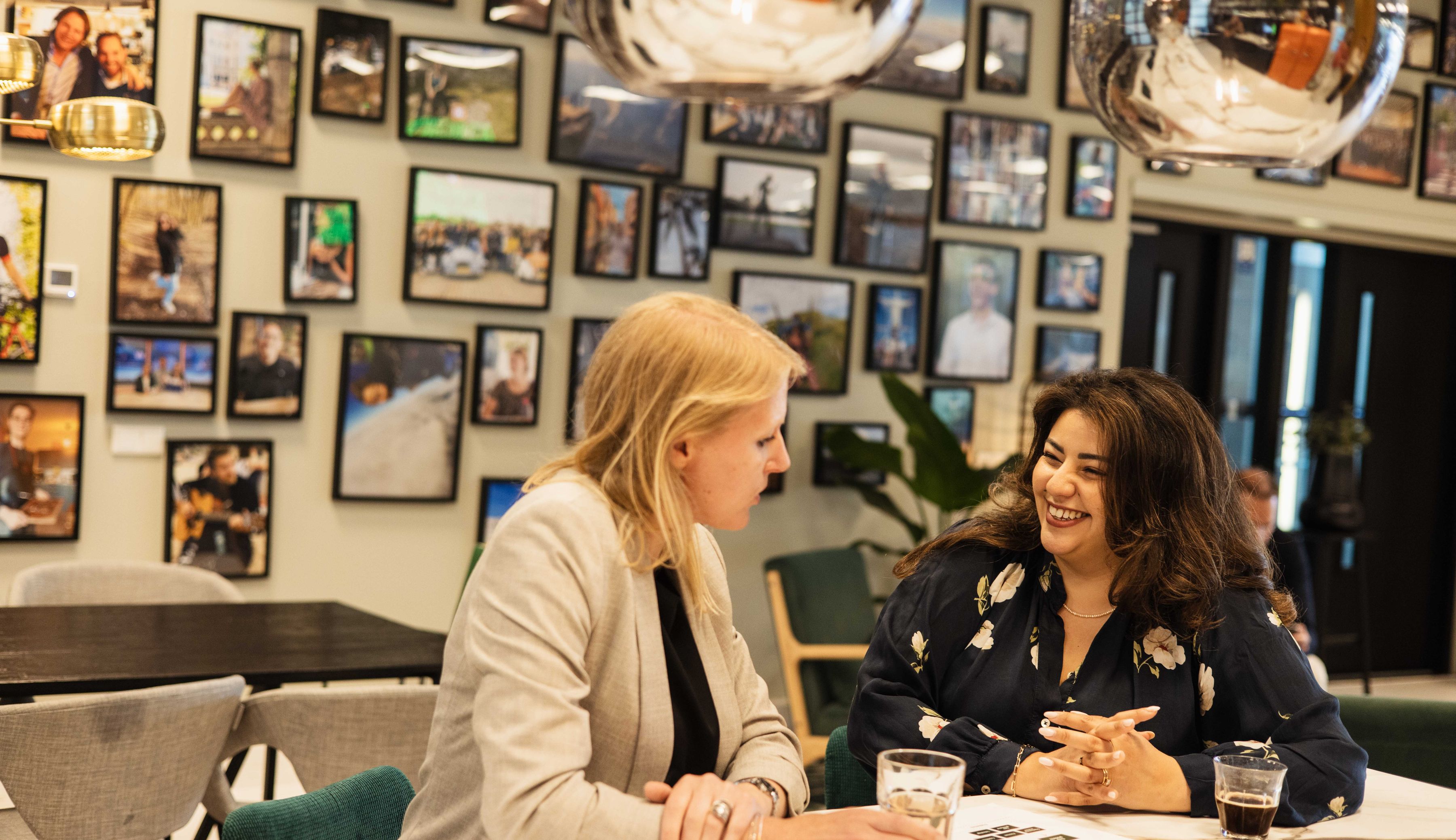
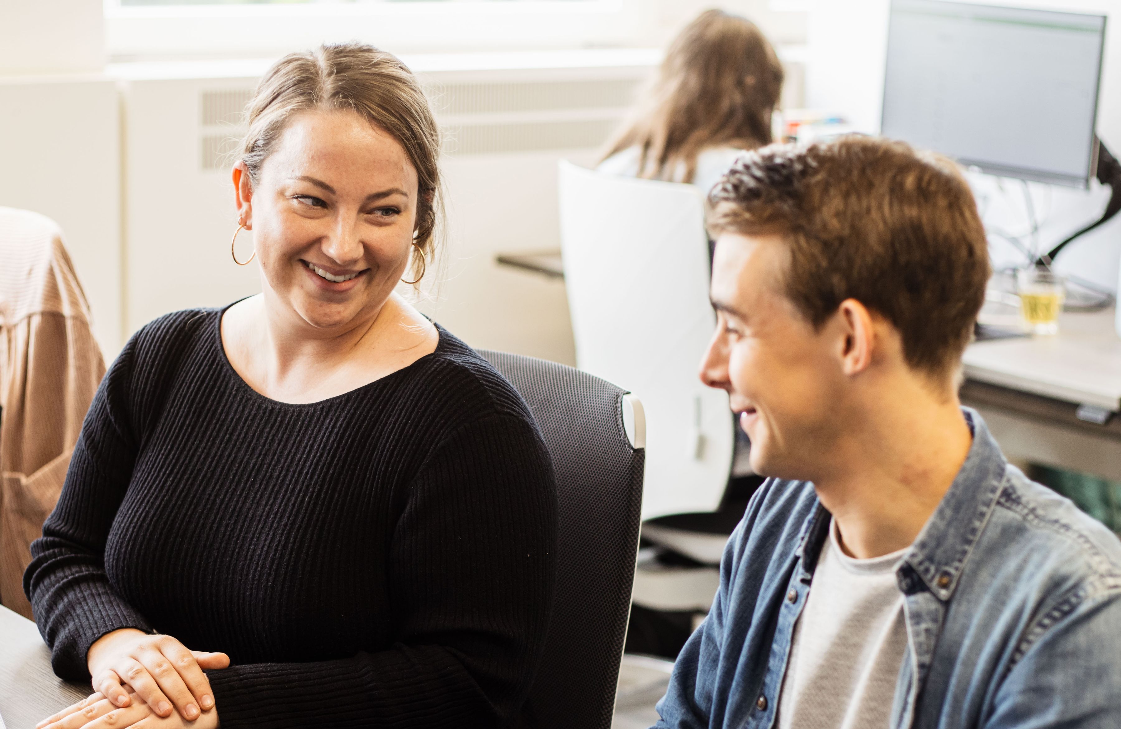
- Visual and textual context should be better aligned. Participants found discrepancies between the visual elements and the textual content of the website, which confused them. For example, a picture of our colleagues talking around our kitchen/bar did not support participants’ understanding of us delivering data solutions.
However, as data solutions are generally difficult to capture on visuals, it is our deliberate decision as a consultancy company to show our people instead.
Future
The current website is an MVP, and there is still room for improvement. In the future, we might conduct further research to assist our marketing team to increase the overall experience and effectiveness of the website.
Want to know more?
Our sales team will be happy to talk to you about what we can do for you and your organisation as a research partner.
team Commerce+31(0)20 308 43 90sales@digital-power.com
Receive data insights, use cases and behind-the-scenes peeks once a month?
Sign up for our email list and stay 'up to data':


