How to use Social Network Analysis to understand public opinion
Case: public opinion on Twitter about the Corona measures

The Corona measures are a much discussed topic on Twitter. The crisis team not only fights against Corona's effects on public health, but also tries to maintain legitimacy for the decision to keep certain measures in place among the public. With this practical case we explain how you can make public opinion on Twitter transparent with Social Network Analysis.
Don't know what Social Network Analysis is yet? You can read our explanation in this article.
In order to maintain legitimacy, the crisis team closely monitors public opinion. They use public sources such as polls, the mood in television programs, and the sentiment on Facebook and Twitter.
Consider, for example, closing schools: according to the RIVM, not necessary, but something that the public strongly urged.
As an example, let's look at what we can make transparent for the Corona crisis team based on Twitter data and network analysis.
Collect data
We collected tweets related to the Corona measures during the period 10 to 25 March 2020. This was the period when the first measures were announced. We found 30,580 tweets in total.
Results
Figure 1 shows the network of this dataset:
- The nodes (all dots) are the Twitter accounts (17,344 accounts in total);
- The edges (the lines between the nodes) reflect the communication. Every time a Twitterer has mentioned another Twitterer, you will see a line between these Twitterers (40.344 edges in total).
The communication on Twitter is marked by an @mention (in a post, a comment, or by retweeting someone).
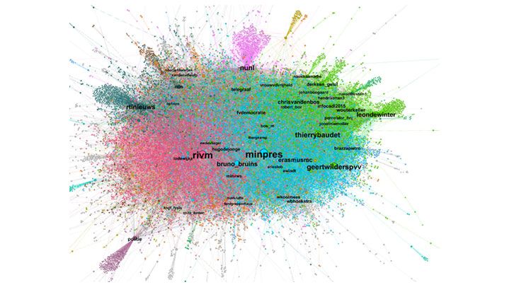
What the sizes of the nodes indicate
The nodes differ in size. The larger nodes reflect the Twitterers most frequently mentioned by others: the larger the node, the more frequent the person was mentioned. The size, therefore, says something about a Twitter user's popularity: who received the most (positive/negative) attention?
In figure 1, you can see that the Twitter account of Mark Rutte (@minpres) and the RIVM was mentioned most often. Logical, since they play a leading role in communicating the measures.
What the colors say
The colours in the network show different clusters. The nodes with the same colour tweeted a lot more about or with each other than the nodes outside this group (these are the nodes with a different colour). We zoom in deeper:
The pink cloud shows a large group of Twitterers tweeting with and about RIVM and the Ministry of Health, Welfare and Sport. Many updates about the virus were shared in this cluster (what do we now know about the virus and how are we doing?), but many questions were also asked, and concerns and criticisms were expressed about the measures.
The blue Twitterers communicate a lot about and with ministers of the current cabinet who have taken the measures (including. minpres, bruno_browns, hugodejonge, arieslob, markrutte, ferdgrapperhaus, wkoolmees, wbhoekstra).
In this cluster, Mark Rutte was retweeted very often. For example, about his visit to the Erasmus MC, which is why the Erasmus hospital is also mentioned a lot. This cloud also contains questions to ministers and criticism about the measures. Both 'ewindt' and 'lbergkamp' are Twitterers with many followers who actively discussed the measures. They received a lot of reactions from followers, and were therefore often mentioned.
In the green cloud, special attention was paid to right-wing nationalist Twitterers (eg. geertwilderspvv, thierybaudet, fvdemocratie, Bos_m, Perculator_hnj, Joostniemoller, leondewinter, Vrouwvdvrijden), and de Telegraaf.
These politicians, journalists and columnists mainly criticised the government's approach. These posts got a lot of comments and were retweeted a lot by their followers.
The lilac cluster consists of people who responded to or retweeted news from NU.nl.
There is a dark green cluster with (discussions about) news from RTL news and NOS (including several NOS journalists).
The purple cluster that protrudes at the bottom left from the word 'police' concerns a tweet about reporting in Corona time, which many people have shared.
Figure 2 below shows the exact same network, but now the larger nodes reflect the Twitterers actively engaging other Twitterers in the discussion, the so-called activators. They ensure that the discussion remains active.
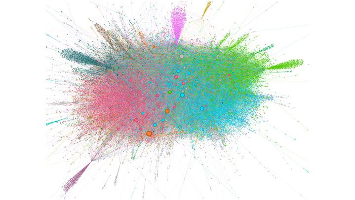
Usually, the names of these Twitterers are at the nodes, so you can immediately see who these activators are. These are people with whom you might want to work or with whom you might want to engage in conversation to reassure or appease them. In this network, these are mainly 'unknown' Twitter users (no public figures).
To protect the privacy of these individuals, we have omitted their names from this figure.
Conclusion
What is striking is that the crisis team mainly communicates via RIVM and cabinet ministers. In addition, right-wing nationalist politicians and supporters have their own green cluster. They mainly communicate with each other about the measures and share their criticism mainly within their own network.
Other (opposition) parties can also be found in the dataset, but they are less active. They are also mentioned less often than the right-wing nationalist parties. For comparison:
- Geert Wilders is mentioned in 4261 tweets;
- Thierry Baudet is mentioned in 3607 tweets;
- GroenLinks is mentioned in 52 tweets;
- PvdA is mentioned in 194 tweets;
- CDA is mentioned in 72 tweets;
- Partij van de Dieren is mentioned in 12 tweets.
- These parties merge into the blue or pink cluster.
Next steps and advice
Now that you've mapped out the clusters, it's time for the next step. First, you will check whether the same concerns are shared in the different clusters as in other clusters. You can do this, for example, by means of Topic Modelling, a method for distilling themes from texts. With regard to the corona measures, this would allow the crisis team to see if they are considering all the public concerns. You can also consider using other social listening methods.
Then, step by step, the team can try to increase its influence outside its own network. In the example, the green cluster would be a good first step. To get in here, they can, for example, collaborate with an influencer or activator active in that cluster.
In this case, the green cluster mainly consists of influential people who are critical of the crisis team's policy. Hence, they will not be easily convinced by the crisis team's message. However, they can be influenced by an adapted communication strategy that shows that the specific concerns within their cluster are recognised. The crisis team can also make an impact by proactively responding to questions that arise within the green cluster.
Former colleague Anika Batenburg was a Data Science Consultant at Digital Power
Anika has a PhD in the field of online communities. She is an enthusiastic researcher with knowledge of statistics, research design, online networks, and automatic text analysis. She is interested in the complete picture, and therefore likes to think along with the organisation on a strategic level.
Receive data insights, use cases and behind-the-scenes peeks once a month?
Sign up for our email list and stay 'up to data':