How do I create a dashboard?
Data visualisation in 7 effective steps
- Article
- Data Analytics

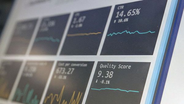
A dashboard can show the most important features of your data in a comprehensible way. From your data you can translate your insights into advice and actions to improve your website, product and/or service. Are you already collecting data and do you want to gain insights from it to take appropriate actions? This article offers the right tools to visualise your data in efficiently and effectively. This will save you a lot of time and effort.
To successfully visualise your data, you need data, a concept, a goal and the right format . But, how do you ensure that you include all these aspects into your dashboard? The following 7 steps will help you visualise the data you collect the easy way.
Step 1. Set your goals
Before choosing a data visualisation tool, you need to set your organisation's KPIs (Key Performance Indicators). Without KPIs, data visualisation turns into a nightmare, because your goal is not clear and information overload is projected on your screen
Step 2. Check your data quality
To load data into your dashboard, it is important that the quality of your data is good. You have to ask yourself whether your dataset is clean.
When you start loading data, it is necessary to know which different data sources exist and what their quality is. For example, if your data is inconsistent, it will not load properly into your dashboard and will give an error. Or you get output that is based on incorrect data. We call this Garbage in, garbage out!
Step 3. Decide what your story will be
Is it clear which story you want to tell and to whom? Who will be using the dashboard? Should actions be taken from the data insights? If so, what actions are involved?
For management, a dashboard with the most important KPIs is often sufficient. Before the operation, you want a more detailed dashboard so that they can take actions based on the insights that emerge from the dashboard. As a result, the dashboard supports the story that needs to be told.
Step 4. Investigate your stakeholders' wishes
When your story is clear, you can make an inventory with your stakeholders of what they would like the dashboard to represent. Do they want to see certain data visualisations at day, week, month or year level? Then you know how to visualise data.
The more data you enter, the slower your dashboard loads. So ask in advance which data is essential (and which is not).

Step 5. Start sketching
Go sketching! Before you start your data visualisation, you can clearly see what works and what doesn't by sketching and drawing your dashboard. Do the most important insights stand out or are they overshadowed by less important insights?
To avoid this, it is important that the data is your starting point in your dashboard and no fancy titles or colours. Make sure your data has consistent colours so stakeholders understand what they're looking at. For example, think of your internal style colours.
Step 6. Request interim feedback
Have you started visualising your data? Then share them per phase with the various stakeholders and ask for feedback. In this way you do not immediately work on your end product, but you include the feedback from stakeholders compared to the previous phase.
You can then continue to build with your stakeholders permission. Do you not involve them in time in the steps you take when visualising data? Then you run the risk of doing a lot of work for nothing. If you don't like your visualisations, it's better to find out in the process than at the very end!
Interim contact with your stakeholders is also useful when you notice that there is a lot of data that doesn't say much. In the different phases you can immediately make an inventory in an easy way of what is and what is not being looked at. Less is more, and based on feedback you can omit insignificant data.

Step 7. Take a critical look at your own work
As discussed above, there should be a clear story in your dashboard. To strengthen your story, overview is key. This is about 'the art of omission'.
Do not use all your available data and remove unnecessary elements. This way you can apply the correct order. Also take a critical look at the layout of your dashboard and look for inspiring examples.
Data visualisation in a dashboard: 13 do's and don'ts
Do you want to get started with data visualisation? Download our 13 do's and don'ts and create a clear dashboard that shows the correct data and looks beautiful.
Data visualisation using dashboarding helps you quickly surface the right insights. On this basis, you make effective, data-driven decisions. Want to get started? Our Data Analytics Consultants are happy to think along with you.
This is an article by Olaf Stempels, Data Analytics Lead Consultant at Digital Power
Olaf has extensive experience in the field of Data Analytics and dashboarding for clients such as Robeco, Ziggo and Holland Casino.
Business Support Managerolaf.stempels@digital-power.com
Receive data insights, use cases and behind-the-scenes peeks once a month?
Sign up for our email list and stay 'up to data':