Data-driven optimisation of offline customer service
PostNL
- Customer case
- Customer Experience
- Data Analytics
- Data consultancy


For some time now, we have been assisting PostNL's customer service department with the optimisation of their online service & contact environment. Various pilots showed that there was also a lot of potential in improving the offline service.
The Process Specialist, who was responsible for this within Team Service & Bots, was given the opportunity to set up a new team as Product Owner. This team would focus entirely on a better connection of the service processes with customer needs, in order to be able to digitise them at an accelerated rate. This new scrum team, Team Service Propositions, also consisted of a Service Designer, a Customer Service Coach, a Content Specialist, a Scrum Master and an Analyst. The new PO asked us to fill the Analyst role.
Our approach
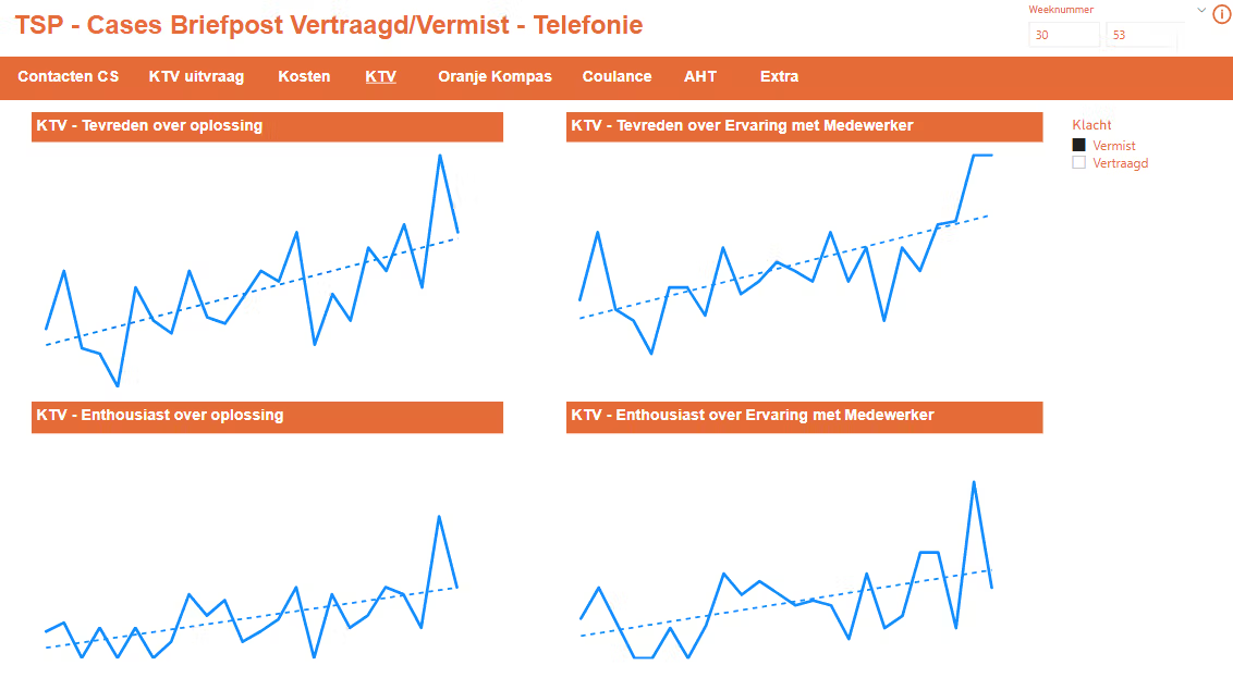
A good basis for data-driven optimisation of the offline customer service was already present. Key Performance Indicators (KPIs) such as customer satisfaction, the contact ratio (amount of letters sent / number of contact moments), the costs, the average handling time (AHT) and the conversion ratios from the number of cases, to the number of customer survey requests, to the number of completed surveys were clearly defined.
There were many ideas and therefore enough pilots to improve upon the results of the offline customer service. In practice it turned out not to be so easy to gain insight into the impact of those pilots. The information came from many different sources. For instance, from Salesforce, Qlikview, the data lake (AWS), Excel, customer surveys, Usabilla and Adobe. To analyse the results of a pilot, the data from all these sources had to be exported and then brought together.
Our Analyst concluded that she could better automate this work. She therefore built a dashboard in PowerBI in which all data sources are linked. This dashboard provides clear insight into all KPIs. Instead of always manually exporting data from different sources, she created a dashboard that contains all the information and which can be refreshed with one click of a button if an analysis needs to be done. This saves a lot of manual work (and therefore time).
The result
The dashboard allowed for the team to have quick insight into how the pilots are doing compared to the standard situation. The Analyst spent less time manually processing data from different sources and could therefore spend more time analysing and sharing other insights with the team.
Using the insights gained from the dashboard, Team Service Propositions was able to improve the pilots they set up during the process. This made pilots more likely to succeed, ultimately resulting in better offline customer service. In addition, business is also very happy with this set-up because they can now easily and clearly view the results in one place.
Team Service Propositions did so well that it has now been transformed into a customer journey team under the new name Team I Get Help.
Want to know more?
Zev will be happy to talk to you about what we can do for you and your organisation as a data partner.
Business Manager+31(0)20 308 43 90+31(0)6 13 06 48 84zev.posma@digital-power.com
Receive data insights, use cases and behind-the-scenes peeks once a month?
Sign up for our email list and stay 'up to data':